| |
| |
|
|
|
 |
Overview |
|
|
|
| |
The Plot Module allows you to display non-image data types and compare them with similar observational data. There are four different types of plots: Differential, Integral, Particle and Criss-cross.
Applications and handling of these plot types are different. Some of them require rendering of the object (Differential and Integral), since they show observered radiation properties, like lightcurves. Others plots take there data directly from the 3D Module, like the Particle and Criss-cross plots. They do not require rendering and can actually change in real-time when manipulating objects in the 3D Module.
Differential
 |
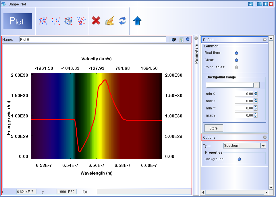
The Differential plot shows how rendered quantities vary as a function of position along the spectrograph slit or as a function of wavelength. The currently available quantities are: Spectrum, PV spectrum, Pixel Intensity and Opacity. |
Integral
 |
The Integral plot displays relations between rendered quantities that have been integrated over the complete slit. The currently available quantities are: Energy flux, Color, Magnitude, Strömgren Radius, Opacity, Time, and Variables. |
Particle
 |
The Particle plot relates a variety of spatial and kinematic properties of the individual particles of the 3D Module to each other. Its special function is to relate the projected position and velocity components in various coordinate systems. The quantities included are: xyz-components of 3D position and velocity, projected tangential and radial position and speed, position-angle, proyected poloidal velocity component and the deviation from projected radial motion. |
Criss-cross
 |
Criss-cross maps are a new type of kinematic mapping that has been invented by the Shape developers to detect and characterize deviations from radial expansion based on detailed tangential proper motion observations. See the appropriate section below for details. |
The plot module takes only values from within the area of the spectrograph slit. So, make sure to adjust its width and height appropriately.
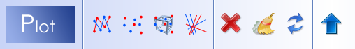
Open the Plot Module by clicking on the blue plot icon on the toolbar of the Desktop.
The Plot Module is divided into the usual three section: the main area displays the plots, at the top is a toolbar and on the right is the parameter panel. To display anything, you first add a plot by choosing from one of the plot types on the toolbar.
To start click on one of the four plot types to open a new plot window. Make sure to choose the right type for your purpose. When you add more plots, they are displayed in a horizontal row. When the available display space is exceeded, a scrollbar at the bottom gives access to all plots.
To delete a plot click on the plot to select it (note the red frame around it) and click on the red X button on the toolbar. By clicking on the broom icon or the circling arrows icon, you can erase or refresh the selected plot, respectively. The blue arrow button allows you to maximize the selected plot. After maximizing the arrow turns red and points downwards, which allows you to restore the plot frame to its original smaller size.
To simultaneously refresh all plots click on the large blue Plot button of the toolbar. |
|
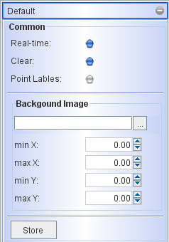
There are a few parameters that all plot types share. They are in the Default tab of the Parameter Panel.
The Real-time buttons enables the graph to listen to changes in the 3D Module. When enabled, a plot is updated automatically after making changes in the 3D Module. Depending on the type of plot and the amount of data to process, this may be instantaneous (e.g. Particle Plot) or may take a few seconds to show the updated plot (e.g. the Criss-cross map).
When the Clear button is enabled, a plot is erased before displaying a change after rendering. When disabled the data from the previous plot are kept and/or included in the previous data set. For instance, when you calculate a lightcurve using a time sequence generated with the Animation Module, then you must disable the Clear button, in order to keep all data points in the plot. |
|
Individual data points can have a label when you activate the Point Label button. This is useful, e.g., to identify points in a scatterplot of non-sequential data points.
Sometimes observational data are not available in numerical form, but as a plot on an image, e.g. from a figure in a scientific journal. To compare such data with the model you can import the image as a Background Image in the Plot Module. Use the "..." file dialog to load the image. Then you can use the min X, max X, min Y and max Y settings to adjust the placement of the image with respect to the plot in Shape.
The Store button allows you to save the currently displayed model data set in a new data item that you can access and customize in the Data tab of the Graph Properties (to open click on the little calculator icon at the top-right of the plot). To see the stored graph and new model click on the Plot button. |
Load data:

You can compare the model output with observed data in the same plot. Use the Load Data icon to open the data import dialog:
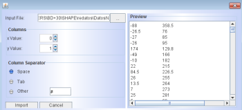
To properly load the data, make sure to select the correct columns (starting at 0,1,...) and choosing the right Column Separator and, of course, the full path for the input file. The display of the data can now be controlled from the Data tab in the Graph Properties dialog.
Save plot data:

You can save either the plot image as it is shown in the display or save the plot data themselves in ascii format. When you click on the blue marble icon you can choose between these to options. A file saving dialog will then open. Make sure to select an appropriate file extension when you save an image. For plots that include lines and/or written labels we recommend to use .png, rather than the common .jpg that is often used for images.
Graph Properties:

For each plot you can set the graph properties separately. The properties dialog is similar to that of other graphs, except for the additional Data tab.
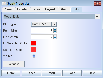
The drop-down menu at the top allows you to select from the current Model Data or other data sets like observed and Stored data. The Plot Type includes the options of Scatter, Connected or Combined. You can select the color of the data set that is plotted and make it invisible by deselecting the Visible button. Use the Remove button to delete the selected data set.
|
|
Differential plot |
|
|
The Differential plot shows how rendered quantities vary as a function of position along the spectrograph slit or as a function of wavelength. The currently available quantities are: Spectrum, PV spectrum, Pixel Intensity and Opacity. |
The Differential Plot has four Options that are specific to this type of plot: Spectrum, PV Spectrum, Pixel Intensty and Optical Depth. Click on the Type drop-down menu to select one of these four options.
The Spectrum plot uses wavelength as its reference and takes the ranges from the maximum and minimum values in the Transfer Renderer settings. Velocity values are displayed at the top of the plot and take as reference the λ_ref wavelength as given in the Transfer Renderer. The values are for the wavelengths at the tick marks of the wavelength axis at the bottom of the plot.
The PV Spectrum takes the PV diagram and integrates it along the spectrograph slit. The minimum and maximum values are the same as those of the PV diagram, i.e. the same as those set in the PV Diagram parameters of the Rendering Module.
The Pixel Intensity option plots the pixel brightness along the vertical axis of the slit. The intensity is integrated perpendicular to the slit. The down-up direction of the slit is mapped to the horizontal left-to-right direction, i.e. the slit is rotated clockwise by 90 degrees. |
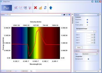
This example of a Differential Plot is a P-Cygni profile and includes only a very narrow range of wavelength. Use the P-Cygni demo project in the Physics Module to reproduce this plot. See the Dust demo project for an example of a broad-band spectrum.
Click on image above to view full resolution version.
|
|
| Integral plot |
|
|
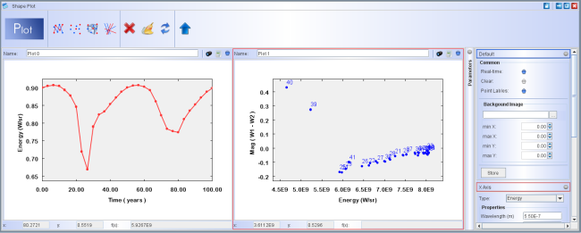
The Integral plot displays relations between rendered quantities that have been integrated over the complete slit. The currently available quantities are: Energy flux, Color, Magnitude, Strömgren Radius, Optical Depth, Time, and Variables. You can choose to plot each of these versus any other. Each quantity has a set of additional parameters that have to be set, which will now be discussed. |
Energy:
Wavelength (m): the central wavelength of the spectral band that will be included.
Bandwidth (m): the full spectral bandwidth to be included, half of this is to to lower and half to higher values of the central wavelength.
Color:
A color is defined by the difference between the integrated flux from two wavelength bands. Each has a central wavelength and a bandwidth. You can choose to define the colors in terms of magnitudes or plain energy flux. By default it is set to magnitudes. To use energy flux disable the Magnitudes button. If using magnitudes you need to define which of the two wavelengths is to be used as a reference. Click on the corresponding F0 button to select the reference band.
|
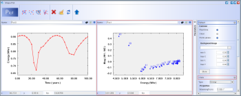
An example of an Integral plot, showing the lightcurve (left) of an eclipsing binary with an accretion disk. On the right is a plot of energy vs. color. Use the spiral disk demo project to reproduce such a curve. See also the Animation module for more on this demo. Click on the image to see a full resolution version.
|
Magnitude:
To determine the magnitude of an object you two reference values are required: The absolute magnitude Mref and the luminosity Lref (W). The default values are those of the Sun.
|
| |
The Particle plot relates a variety of spatial and kinematic properties of the individual particles of the 3D Module to each other. Its special function is to relate the projected position and velocity components in various coordinate systems. The quantities included are: xyz-components of 3D position and velocity, projected tangential and radial position and speed, position-angle, proyected poloidal velocity component and the deviation from projected radial motion. |
In order to have higher flexibility in plotting models, only data with the following selection criteria are included in a plot. Make sure that these settings are as wanted:
- Particles inside the spectrograph slit (see Rendering Interface)
- Objects that are selected in the 3D Module
- Percentage of particles displayed in the 3D Module
By default, particles have the color and color intensity as given in the 3D Module Color and Density Modifier settings of the object. The color settings can be changed in the data tab of Graph Properties dialog (see above).
Realtime setting: When this option is enabled, some of the changes that you may be doing in the 3D Module are reflected in the Particle Plot while you are changing the parameters. This allows quick inspection of the behavior when changing a variable. This applies to all camera transforms. This feature allows a quick preview of the position-velocity diagrams, without having to render. Just choose the corresponding axes: horizontal z Speed and vertical Y Position. You can then rotate the camera view and see how the p-v plot changes. You can include a background image to quickly make a preliminary fit, before making more detailed fits in the Rendering Module.
|
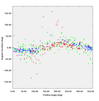
An example of a particle plot, where observed data are shown in green and two different sections of the model are shown in red and blue. Click on the image to open a higher resolution version.
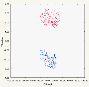
As you rotate the camera viewpoint the particle plot, here a p-v diagram, changes in real-time (provided the Real-time button is enabled) . |
|
Criss-cross maps can be generated from observed data by reading them in as a particle system with 3D velocity vectors. The following step-by-step guide is valid for observed data and Shape model. For observed data start at instruction 1. and for Shape models jump right to instruction 4.
1. Make an ascii file with columns of x,y,z,vx,vy,vz,density. Separate the columns by spaces or tabs. z, vz and density are arbitrary and you can set them as z=0, vz=0 and density=1. All the particles will be in a plane (the plane of the sky).
2. Go to the FILE dialog of the 3D Module. Make sure that the 3D Module is NOT separate from the main interface, otherwise the FILE menu is not visible. Click on "Import External System". A file import dialog opens where you can choose how the columns are to be read. If you have created the ascii file as mentioned above, then you just have to choose the file name and click on "Import". If the separator between the columns is not space or tab then you might have to choose it manually. But Shape tries to detect that automatically.
3. Now you should have a new particle system object in the 3D Module with the particles visible in white. If they are not all visible, check the size of the Shape view to be not too big or too small. You might want to change the color of the particle system. This will make the position more visible in the criss-cross map overlay.
4. With the particle system selected, enable "Show Velocities" and adjust the "Length Factor" such that you can see the vectors. This step is to check the positions and velocities have been imported correctly, but is not necessary to generate the criss-cross map.
5. Make sure that the particle system is selected in the 3D Module AND in the Render Module the SLIT IS WIDE OPEN and includes the whole field of view. The plot includes only those vectors that are included in the slit and of those particle systems that are selected in the 3D Module!
6. Go to the Plot Module and add a Criss-Cross plot. Click "Plot" in the Plot Module. After a short while of processing the criss-cross map should appear together with the positions of the vectors overlayed.
7. Now you can adjust the parameters of the plot. If you wish to see the criss-cross map only, then
set Transparency to 0. Open the "Edit" dialog to change the resolution in pixels of the map. In the dialog select the "Gaussian Blur" filter and set both values to 15 or so depending on your map. Also select a suitable greyscale in the "Normalization" filter. "Square" is usually quite adequate.
8. In the graph properties dialog (click on the little calculator icon at the top-right of the plot), select the "Layout" tab and set the Graph Size height and width to equal values, e.g. 512, such that the the vertical and horizontal scaling is the same. Click "Done" to confirm the action. |
|
| |
|
|
|
|
|